How to Pick Accent Colors: Adding Personality to Your Space
In this Semperfidiy.com post, learn how to pick accent colors with color theory and personal flair, inspired by our home’s teal kitchen, coral bedroom, green master bathroom, and brass guest bedroom, with photos to bring the ideas to life!
RJ Baker
4/2/20256 min read


Welcome back to Semperfidiy.com, where we’re all about making your home a reflection of you! One of the easiest ways to add personality to any space is through accent colors—those pops of color that bring a room to life without overwhelming it. In our home, we’ve used accent colors to great effect: vibrant teal in our kitchen (you’ve seen it in our Kitchen Remodel Series!), warm coral in our bedroom, fresh green in our master bathroom (along with faux plants!), and elegant brass in our guest bedroom. But how do you pick the right accent color for your space? Today, I’m sharing my tips for choosing accent colors, with a little color theory to guide you, and showing how we used teal, coral, green, and brass to add character to our rooms. Let’s dive in and get colorful!
Start with a Neutral Base: Setting the Stage
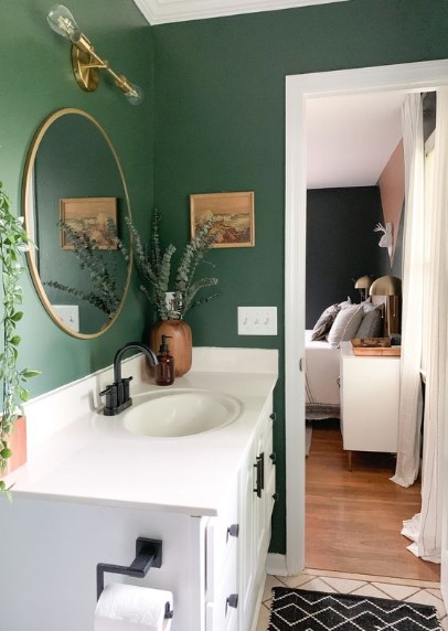
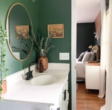
Before picking an accent color, you need a base to work with—often a neutral palette, but sometimes a single bold wall can set the stage. In our kitchen, we started with Sea Salt by Sherwin Williams on the walls, white cabinets, and natural wood trim, creating a serene, farmhouse coastal vibe. In our bedroom, we have soft gray walls with white trim, offering a calm backdrop. The master bathroom features white walls with a dark green accent wall, giving a fresh, modern feel. The guest bedroom has white walls with an avocado green accent wall, adding a retro vibe. These bases—whether fully neutral or with a bold accent wall—give you a foundation to layer in accent colors without clashing. A neutral-heavy palette ensures your accent color stands out as a focal point, while a bold wall can guide your color choices.
Tip: If your walls are too bold for your taste, consider toning them down with a neutral shade on most walls, keeping one as an accent. The Spruce recommends the 60-30-10 rule: 60% dominant color (walls), 30% secondary color (furniture), and 10% accent color (accessories).
Use Color Theory to Find Your Perfect Pop
Color theory helps you choose a shade that complements your base without overwhelming the space. Here are a few key concepts to guide you:
Analogous Colors: These are colors next to each other on the color wheel, like blue, blue-green, and green. They create a harmonious look. In our kitchen, the Sea Salt walls have blue-green undertones, so we chose teal—an analogous color—for our accent. The teal in our KitchenAid mixer, microwave, oven mitts, towels, and mason jar chandelier feels cohesive with the walls but adds a vibrant pop. In the master bathroom, the dark green accent wall pairs with lighter green accents (like towels and faux plants), which are also analogous, creating a fresh, spa-like vibe.
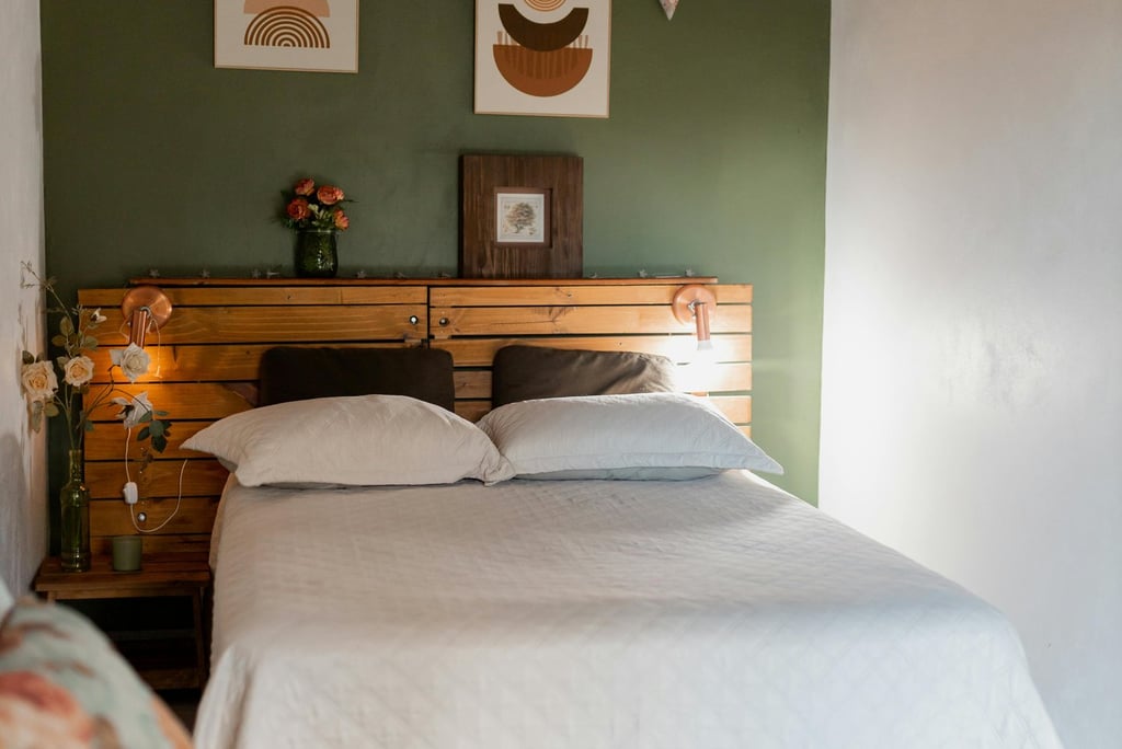
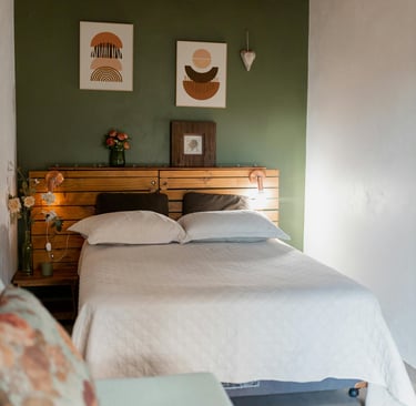
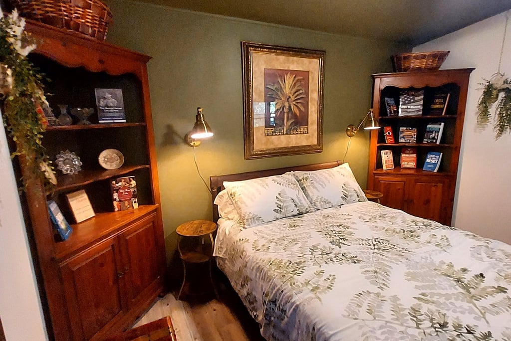
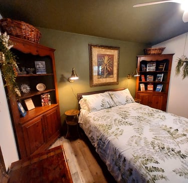
Triadic Colors: These are three colors evenly spaced on the color wheel, like red, yellow, and blue. They offer a balanced yet vibrant contrast. In our bedroom, the soft gray walls are a neutral backdrop, so we chose coral—a warm, peachy-orange shade—as our accent. Coral is part of a triadic scheme with gray (which often has blue undertones) and can pair with yellows or blues, giving us flexibility to add more colors later.
Complementary Colors: These are opposites on the color wheel, like blue and orange or green and red. They create high contrast and make each other pop. In our guest bedroom, the avocado green accent wall (a bold green) pairs beautifully with brass (a warm, golden tone), which acts as a complementary accent. The warmth of the brass adds a cozy glow against the green, enhancing the retro vibe.
The 60-30-10 Rule: This design principle keeps your accent color in check. In the kitchen, Sea Salt and white cabinets are the 60%, natural wood trim is the 30%, and teal is the 10%. In the bedroom, gray walls and white bedding are the 60%, furniture is the 30%, and coral is the 10%. The same applies to the master bathroom (white walls, dark green accent wall, lighter green accents) and guest bedroom (white walls, avocado green accent wall, brass accents).
Resource: Sherwin Williams’ ColorSnap Visualizer (available on their website or app) is a fantastic tool for testing accent colors against your base. Benjamin Moore’s Color Trends reports also offer inspiration, suggesting warm metallics like brass and vibrant hues like coral for 2025—a trend we’re clearly ahead of!

Reflect Your Personality: What Speaks to You?
The best accent color reflects your personality and brings you joy. In our kitchen, we chose teal because it reminds us of the ocean, tying into our farmhouse coastal aesthetic, and reflects our playful, adventurous spirit. In our bedroom, coral brings a warm, cheerful energy that makes the space feel like a cozy retreat—it’s a color that always makes me smile. For the master bathroom, we picked a lighter green to complement the dark green accent wall and faux plants, creating a spa-like vibe that feels fresh and calming. In the guest bedroom, we went with brass to add a touch of elegance and warmth against the avocado green accent wall, giving the space a retro yet timeless feel for our guests.
Tip: HGTV suggests looking at your wardrobe, artwork, or favorite places for inspiration. If you’re drawn to certain colors in your clothes or a place you love (like the ocean for us!), that’s a great starting point for your accent color.
Test Before You Commit: Avoid a Color Mishap
Before going all-in, test your accent color in the space. Lighting can drastically change how a color looks—our Grenada Green phase taught us that the hard way! In the kitchen, we bought a single teal towel to see how it looked against the Sea Salt walls and natural wood trim before committing to larger pieces like the mixer. In our bedroom, we started with a coral throw pillow to test the shade against the gray walls. For the master bathroom, we added a light green hand towel to see how it paired with the dark green accent wall and faux plants. In the guest bedroom, we tested a small brass lamp against the avocado green accent wall. These small tests gave us confidence to add more of each color. The Spruce recommends using small accessories—like pillows, throws, or decor items—to test a color, since they’re easy to swap out if the shade doesn’t work.
Incorporate Your Accent Color Strategically
Once you’ve chosen your accent color, use it strategically to add personality without overpowering the space. Here’s how we did it:
Teal in the Kitchen: We incorporated teal through our KitchenAid mixer, microwave, oven mitts, towels, and a teal blue mason jar chandelier with Edison bulbs. On the floating shelves, we added teal decorative pieces like a pasta display, a small vase, and holiday casserole dishes.
Coral in Our Bedroom: We used coral in a throw blanket, pillows, a small rug, and a piece of artwork above the bed. The warm hue adds a cheerful pop against the gray walls, making the space feel cozy and inviting.
Light Green in the Master Bathroom: We chose a lighter green for towels, a shower curtain, and faux plants (like a faux eucalyptus garland and a potted fern). The light green softens the dark green accent wall, creating a fresh, spa-like atmosphere.
Brass in the Guest Bedroom: We used brass in a bedside lamp, drawer pulls on the dresser, a picture frame, and a small mirror. The metallic sheen adds a subtle glow against the avocado green accent wall, enhancing the retro vibe.
Tip: Start with a few key pieces—textiles, decor, or small furniture—and add more if you love the look. The 60-30-10 rule ensures your accent color stays a highlight, not the main event.
Final Thoughts: Let Your Space Shine
Picking the right accent color is all about finding a shade that complements your base, reflects your personality, and brings joy to your space. Whether it’s the vibrant teal in our kitchen, the warm coral in our bedroom, the fresh green in our master bathroom, or the elegant brass in our guest bedroom, these pops of color have made our home uniquely ours. Use color theory to guide you, test before you commit, and incorporate your color strategically to create a space that feels both cohesive and personal. What’s your favorite accent color? I’d love to hear about it in the comments below, or tag us on social media with your own Semperfidiy projects using #SemperfidiyDIY!
Until next time,
RJ Baker
Semperfidiy.com