The Importance of Color Choices in DIY: Lessons from Our Kitchen Reno
Tips, tricks, and resources for finding the perfect color for your room. Trust us, the once owners of a Key West, Key Lime kitchen!
RJ Baker
3/24/20256 min read


Hey there, Semperfidiy.com readers! If you’ve been following our Kitchen Remodel Series, you know our double-wide kitchen has seen some wild transformations—from a 2000s floral nightmare to a chaotic Grenada Green phase that looked like a Key West resort exploded in our trailer. Those experiences taught us some hard-earned lessons about the importance of color choices in #DIY projects, and today, I’m sharing those insights with you. Whether you’re painting a kitchen, a bedroom, or a tiny powder room, the colors you choose can make or break the space. Let’s dive into the key factors to consider—lighting, room location, paint sheen, and thinking ahead to avoid disasters—using our kitchen reno as a case study. Plus, I’ll share some resources to help you pick the perfect hue for your next project.
Lighting: The Make-or-Break Factor
One of the biggest lessons we learned during our kitchen reno was the impact of lighting on color. Our kitchen has five windows, which means it’s flooded with natural light—sometimes to an alarming degree. When we painted the walls Grenada Green in Phase 2, we didn’t account for how that bright, tropical green would look under all that sunlight. The result? A glowing, neon jungle that made the space feel more like a Caribbean nightclub than a cozy kitchen. The natural light amplified the intensity of the green, reflecting off the black cabinets and making the room feel chaotic.
Lighting can dramatically change how a color looks in a space. Natural light, like we have in our kitchen, tends to show a color’s truest form, but it can also make bold colors feel overwhelming. Artificial light, on the other hand, can cast warm or cool tones depending on the bulb type—incandescent bulbs can make colors look warmer, while fluorescent bulbs can make them look cooler or even washed out. In our gray walls phase (Phase 1), the gray we chose ended up with a purple hue because of the lighting in the room, a mistake we didn’t catch until it was too late.
Tip: Always test your paint colors in the actual space before committing. Paint a small section of the wall or use a sample board, and observe how the color looks at different times of day under both natural and artificial light. Sherwin Williams offers sample sizes of their paints, which I’m a huge fan of—I’ve been using their paints for years, especially their Cashmere line, which goes on like butter. If you prefer Benjamin Moore or Behr, they also offer sample sizes, typically in 8-ounce containers, perfect for testing.

Room Location: Context Matters
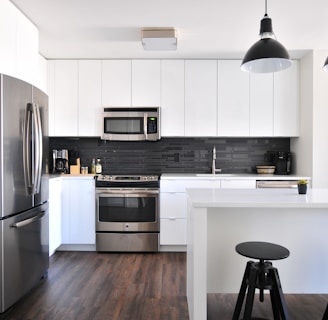
The location of the room in your home plays a big role in color choice. Our kitchen is a central space in our double-wide, where we cook, eat, and gather with family. It’s a high-traffic area that needs to feel inviting and functional, not chaotic. When we chose Grenada Green, we were thinking “bold and fun,” but we didn’t consider how that color would feel in a space where we spend so much time. After a long day of work, coming home to a neon jungle wasn’t the relaxing vibe we needed. It was only when we started painting the walls Sea Salt by Sherwin Williams that the kitchen began to feel like a sanctuary.
If you’re painting a bedroom, you might want a color that promotes relaxation—think soft blues, greens, or neutrals. For a home office, you might choose a color that boosts focus, like a muted gray or a deep blue. Kitchens and living rooms, like ours, often benefit from colors that feel warm and inviting but not overwhelming. The location also affects how much natural light the room gets—north-facing rooms tend to have cooler light, which can make colors look more muted, while south-facing rooms get warmer light, which can make colors pop.
Resource: The Sherwin Williams ColorSnap Visualizer (available on their website or app) is a fantastic tool for previewing how colors will look in different rooms. You can upload a photo of your space and test different shades virtually. Benjamin Moore’s Personal Color Viewer and Behr’s ColorSmart tool offer similar features, letting you experiment with colors before you buy.
Paint Sheen: Function Meets Aesthetics
The sheen of the paint you choose is just as important as the color itself. Sheen affects how the paint reflects light, how durable it is, and how easy it is to clean—crucial factors in a high-traffic space like a kitchen. In our Grenada Green phase, we didn’t pay much attention to sheen, and the flat finish we used made the walls look velvety but also made them harder to clean. When we switched to Sea Salt in the final reno, we stuck with a flat finish using Sherwin Williams Cashmere because we loved the soft, non-reflective look, but we knew we’d need to be careful with spills and splatters.
For kitchens and bathrooms, where moisture and messes are common, a semi-gloss or satin finish is often a better choice—they’re more durable and easier to wipe down. In our kitchen, we used a semi-gloss finish on the cabinets to ensure they could handle the inevitable splashes and stains. For living rooms or bedrooms, a flat or eggshell finish can work well, giving a softer look without the need for heavy-duty cleaning. If you’re using Benjamin Moore, their Regal Select line offers a great range of sheens, and Behr’s Marquee line is known for its durability in high-traffic areas.
Tip: Consider the room’s function when choosing sheen. If you’re painting a kid’s room or a kitchen, go for a higher sheen for easy cleanup. For a cozy bedroom, a flat or eggshell finish can create a more intimate vibe.
Thinking Ahead: Avoiding Disasters Later
One of the biggest mistakes we made during our kitchen reno was not thinking ahead. When we chose Grenada Green, we were so focused on being bold that we didn’t consider how we’d feel about the color long-term—or how hard it would be to cover up later. That bright green took two coats of Sherwin Williams Cashmere (with its built-in primer) to fully cover, and even then, it was a challenge. We also didn’t think about how the color would interact with other elements in the room, like the black cabinets and the tropical palm leaf backsplash we added to lean into the Key West vibe. The result was a chaotic mess that clashed with everything.
Thinking ahead means considering how a color will age with you and your space. Will you still love that trendy color in five years? Will it be easy to repaint if you change your mind? It also means thinking about how the color will work with your existing furniture, flooring, and decor. In our case, the Grenada Green clashed with the white peel-and-stick flooring we installed, making the space feel even more disjointed. When we finally chose Sea Salt, we picked a color that was timeless and versatile, ensuring it would work with future updates to the space.
Resource: For inspiration and guidance, check out Sherwin Williams’ Color of the Year archives—they often include tips on how to use trending colors in a timeless way. Benjamin Moore’s Color Trends reports are another great resource, offering palettes that balance current styles with longevity. If you’re a Behr fan, their Color Trends page provides similar insights, along with pairing suggestions for furniture and decor.
Final Thoughts: Choose Wisely, Test Thoroughly
Our kitchen reno taught us that color choices in DIY projects are about more than just aesthetics—they’re about creating a space that feels right for you. Lighting, room location, paint sheen, and thinking ahead are all crucial factors that can make or break your project. By testing colors in your space, considering the room’s function and location, choosing the right sheen, and thinking about the long-term impact, you can avoid disasters like our Grenada Green fiasco and create a space you’ll love for years to come. I’m a big fan of Sherwin Williams paint—their Cashmere line saved us during our final reno—but I’ve also used Benjamin Moore and Behr on occasion, and they’re great options too. Whatever brand you choose, take your time, test thoroughly, and don’t be afraid to step back and reassess if something doesn’t feel right.

What’s your go-to paint color for DIY projects? I’d love to hear about your experiences! Tag us on social media with your own projects using #Semperfidiy!